Kids Stuff
Deliverables
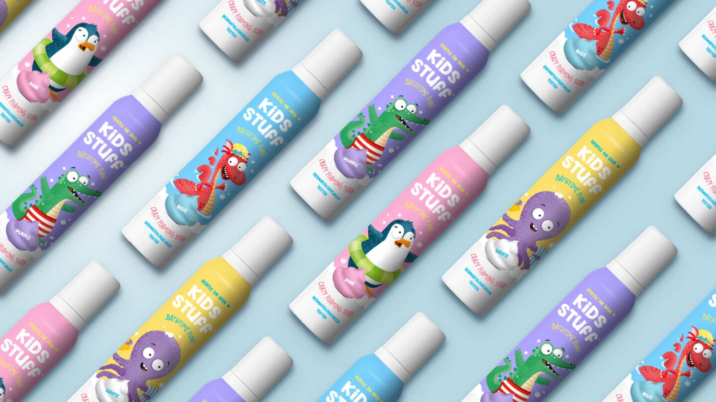
The brand’s original packaging lacked visual appeal and no longer resonated with its target audience of families with young children. The designs were outdated, with synthetic colours and outdated characters that didn’t convey the fun, skin-friendly essence of the product. The challenge was to create packaging that stood out on shelves while reflecting the brand’s playful and caring personality.
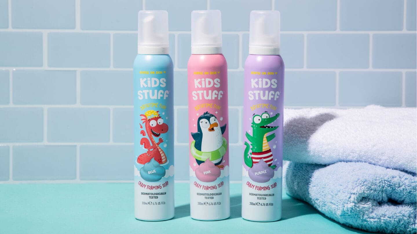
The objective was to reimagine the packaging with a vibrant, engaging design that connected emotionally with kids and parents. The goal was to use softer colours, modernised child-friendly illustrations, and clear messaging to showcase the product’s unique selling points. Additionally, the redesign aimed to elevate the brand’s market position, making it a standout choice among competitors.
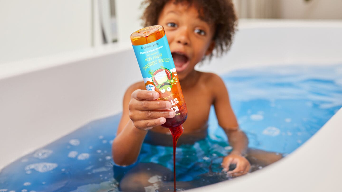
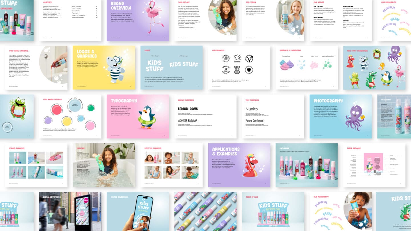
The entire range of packaging was redesigned, along with a new logo and a comprehensive set of branding guidelines. The rebrand transformed the packaging into a lively, eye-catching design, combining bright colours and playful elements that captivated the target audience. Sales increased significantly, with retailers reporting improved shelf visibility and customer engagement. The updated branding not only strengthened the product’s market appeal but also solidified its identity as a trusted, fun, and family-friendly choice for bath time.


