JH Clark
Deliverables
After 240 years of serving the community, JH Clark needed a rebrand that honoured their rich heritage while connecting with modern families. The challenge was to retain the warmth and trust they’d built over generations while presenting a timeless yet contemporary image, making their services feel both enduring and relevant to today’s world.
Research revealed that while JH Clark was highly respected in the community, they lacked a recognisable visual identity. The goal was to strike the perfect balance for such a sensitive service, highlighting their history while positioning them as forward-thinking. The design needed to evoke both tradition and a sense of modernity.
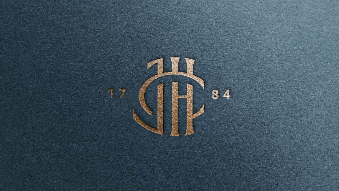
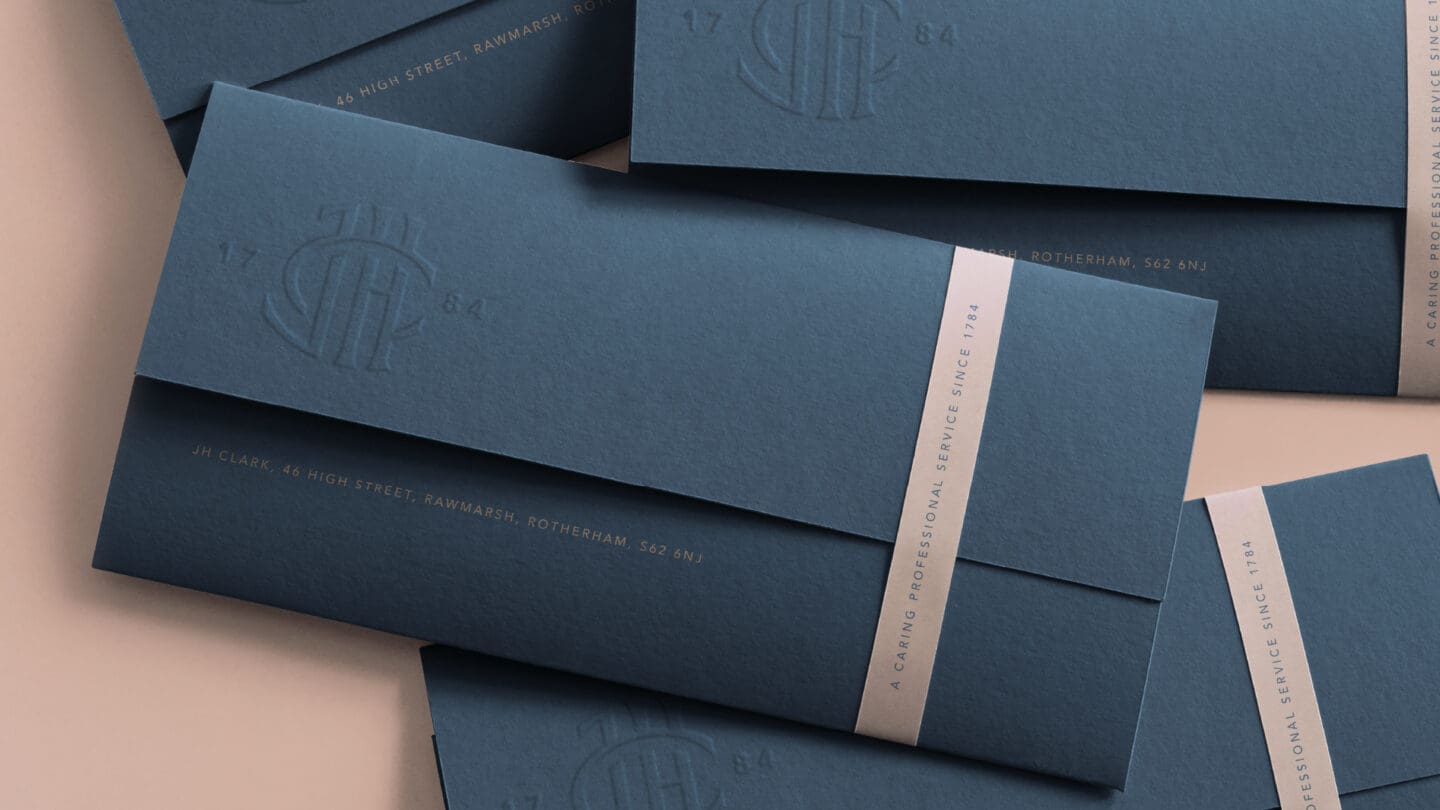
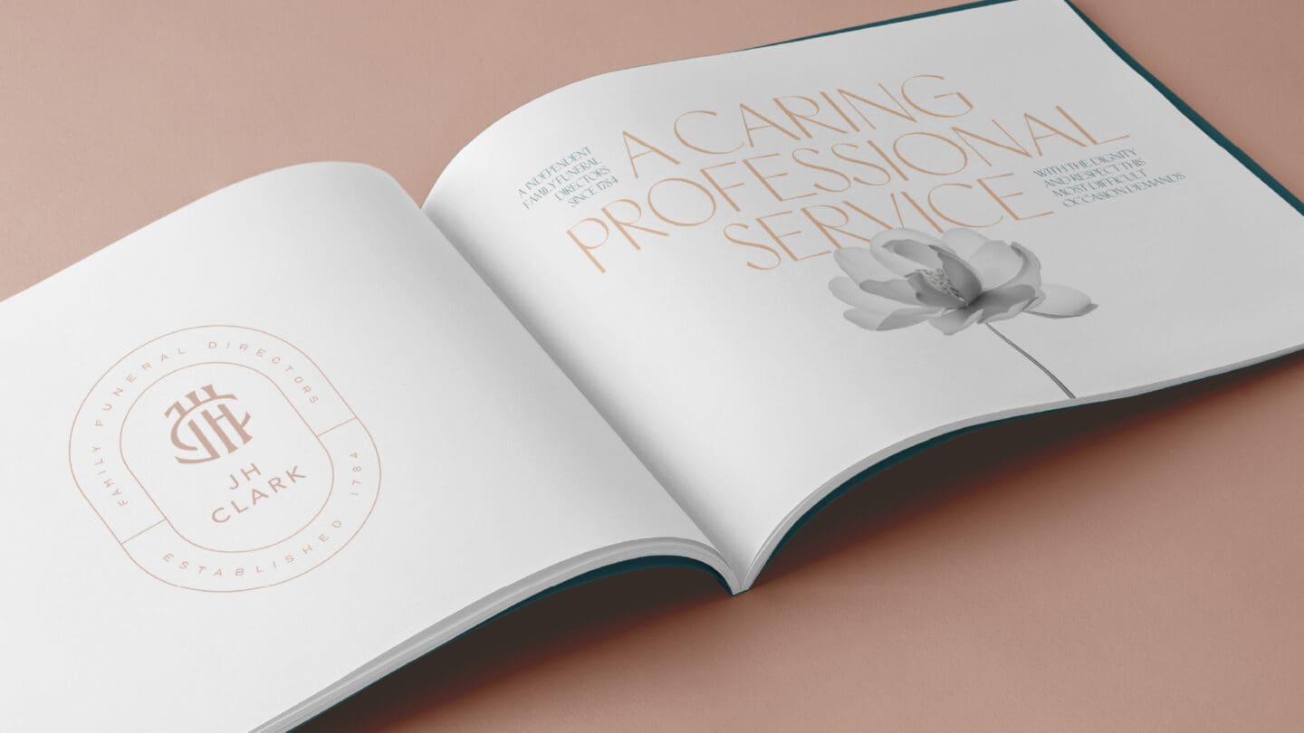
A new monogram and visual style were created to reflect both the personal and enduring nature of their services. The elegant monogram, new colour palette, and thoughtful design details conveyed trust, professionalism, and care. A typeface inspired by chiseled stonework added a timeless touch, honouring their past while reassuring future generations.


